The Most Complete AI-Powered Smart Event Platform
Sustainability Plus
Exhibitor Manual
365 Community
Registration
Website Builder
Event App
AI Matchmaking
Hosted Buying
Floor Plan
Lead Intelligence
Smart Event
3 Countries (United Kingdom, Ukraine, India)
Key Contributions:
780k+ Online Meeting Minutes
380k+ Online Session Minutes
370+ Visitors
13k+ Exhibitors
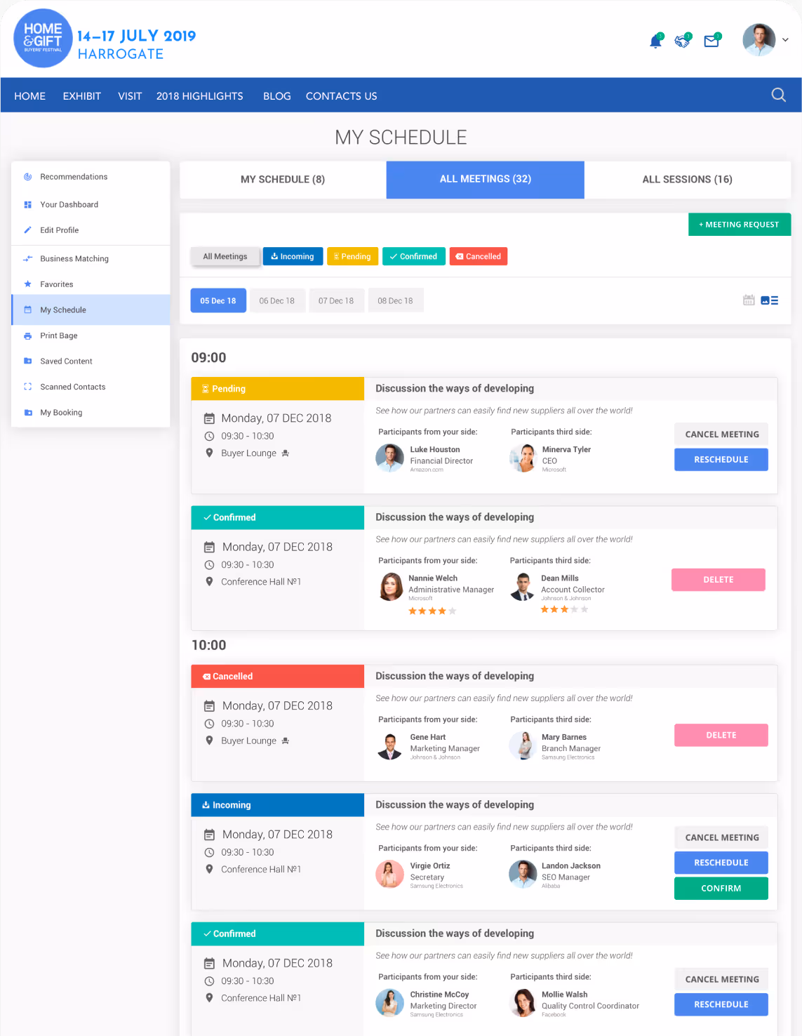
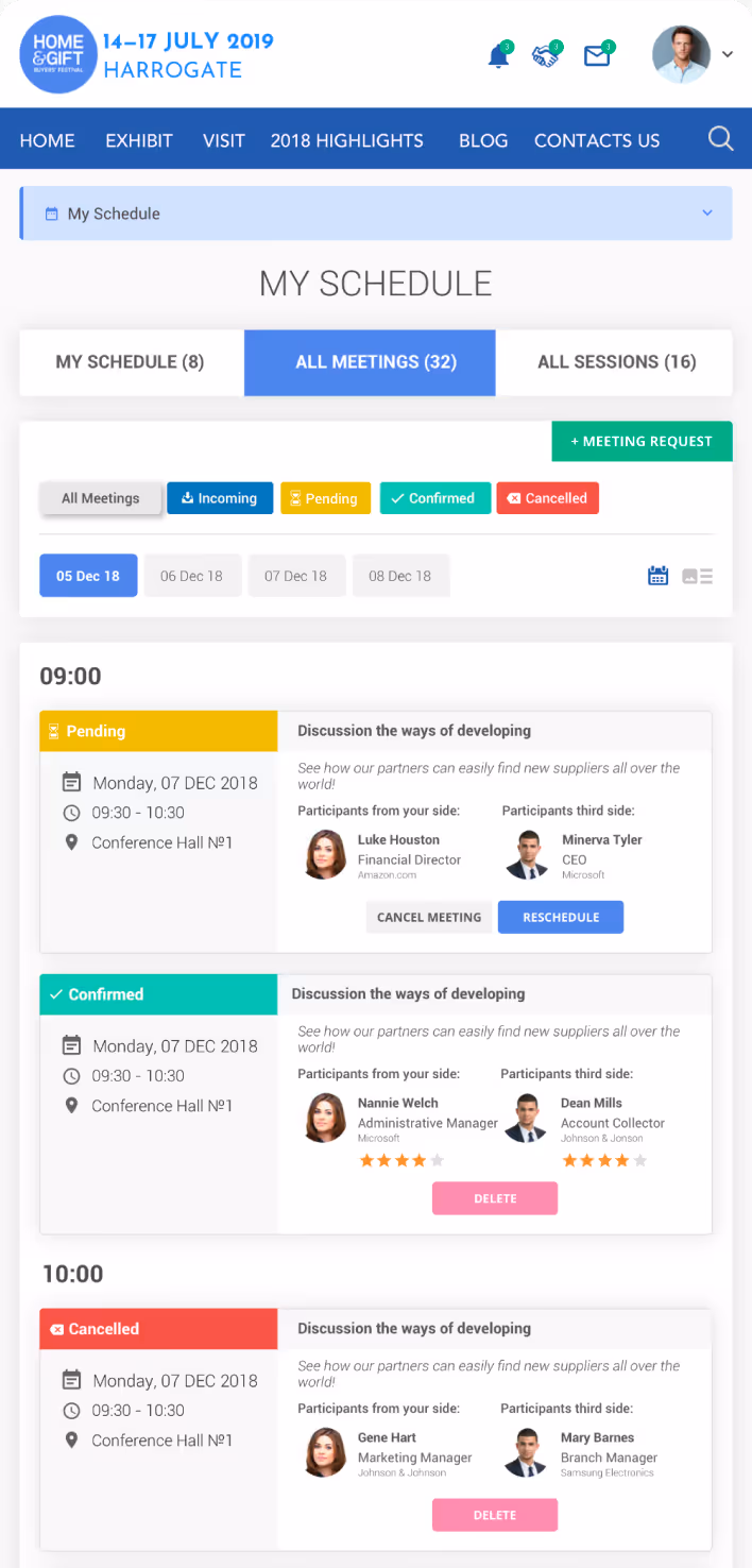
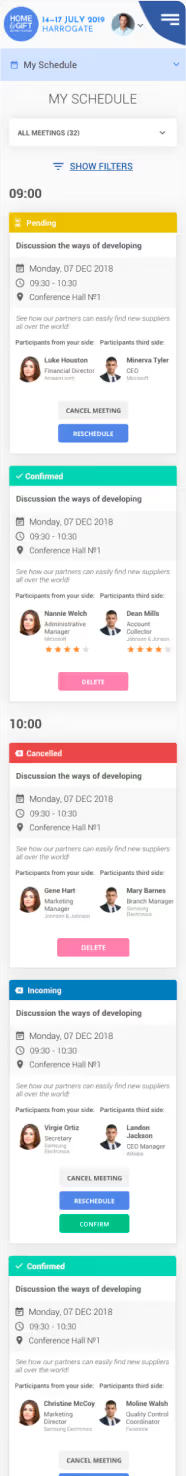
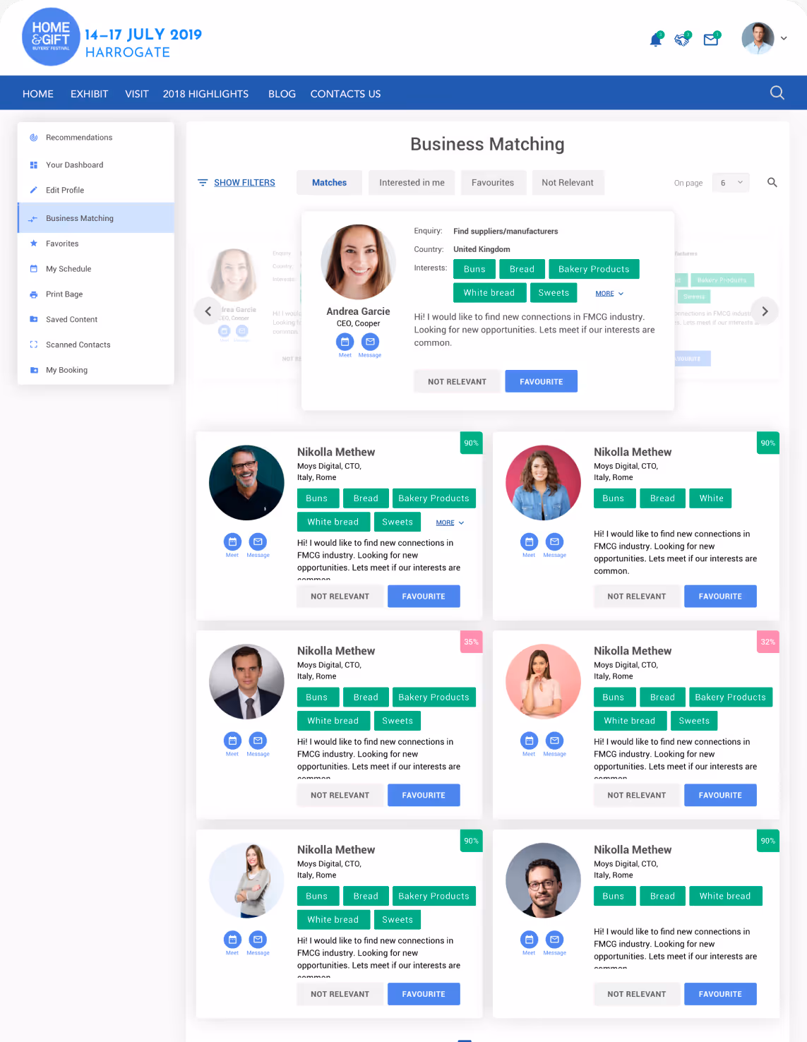
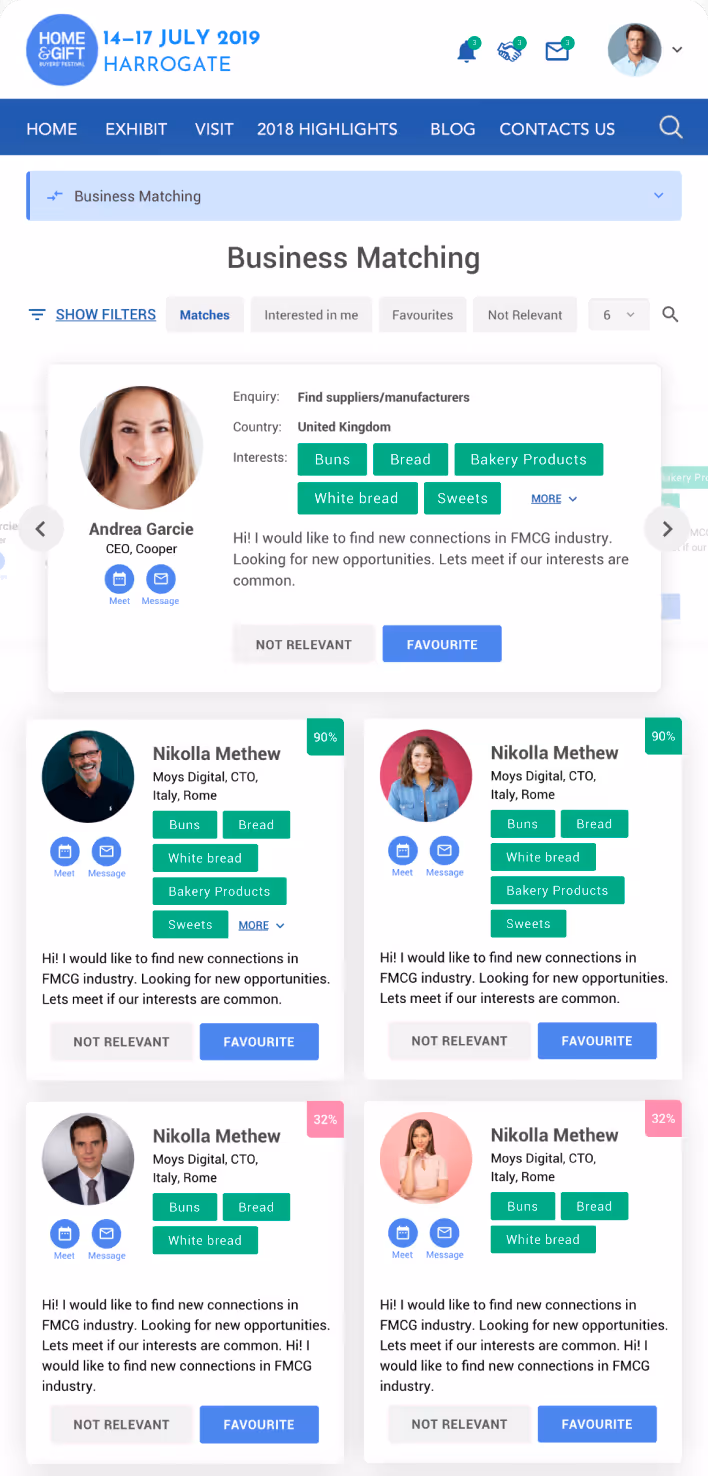
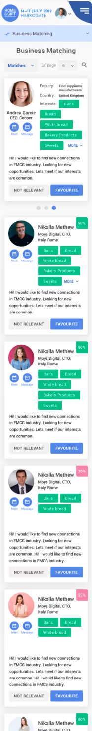
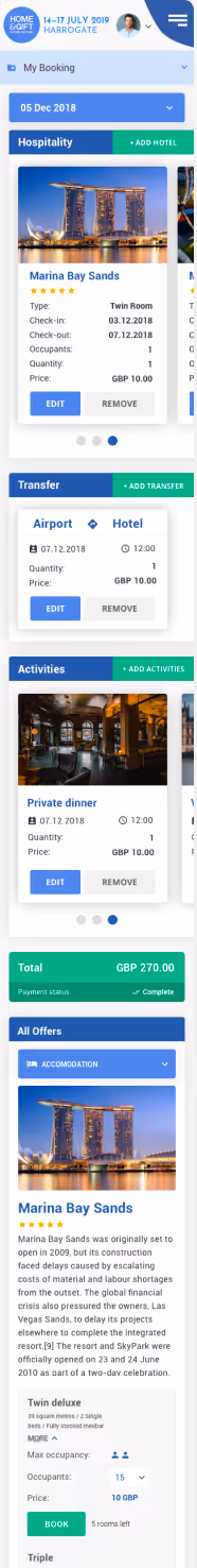
In ExpoPlatform, one of the key problems I solved was the lack of an adaptive and user-friendly design across different devices. The platform was primarily designed for desktop users, making it difficult for attendees, exhibitors, and event organizers to navigate and interact efficiently on mobile devices.
The evolution from a desktop-only approach to a desktop-first strategy, culminating in a hybrid adaptive and responsive design.
Kick-off meeting
I have started my work from a deep discussion with a company CEo and product leader Tanya Pinchuk, which helped me understand the business goal. From the discussion, I have found out that client does not had strong justification in adding new version of a design, so the final goal was not very clear to me, so I decided to perform my own research over the field.
Is a mobile version truly necessary?
Justification and user research
First of all I decided to take a look into the site usage data, and with a help of DS perform a device dependent analysis of the site usage. Amount of site opening per user will be not representative, since it will not show us how long users stay within the platform, so we pulled a breakdown by Time Spend on the platform page by Device Type.
Insight


Top Insight
User feel frustration navigating thru the website on mobile devices, having hard times to navigate due to layout issues.
How should I design a mobile version of the platform, considering that UI elements and graphics are key attractors driving the main business metrics, including event organization success rate?
Adaptive + Responsive design approach
These key principles shaped my approach to designing the new experience:
In ExpoPlatform I focused on creating an intuitive and seamless experience by understanding user needs and behaviors.
I developed a structured design system to ensure a cohesive look and feel across all platforms.
I organized content and features effectively to improve navigation and user engagement.
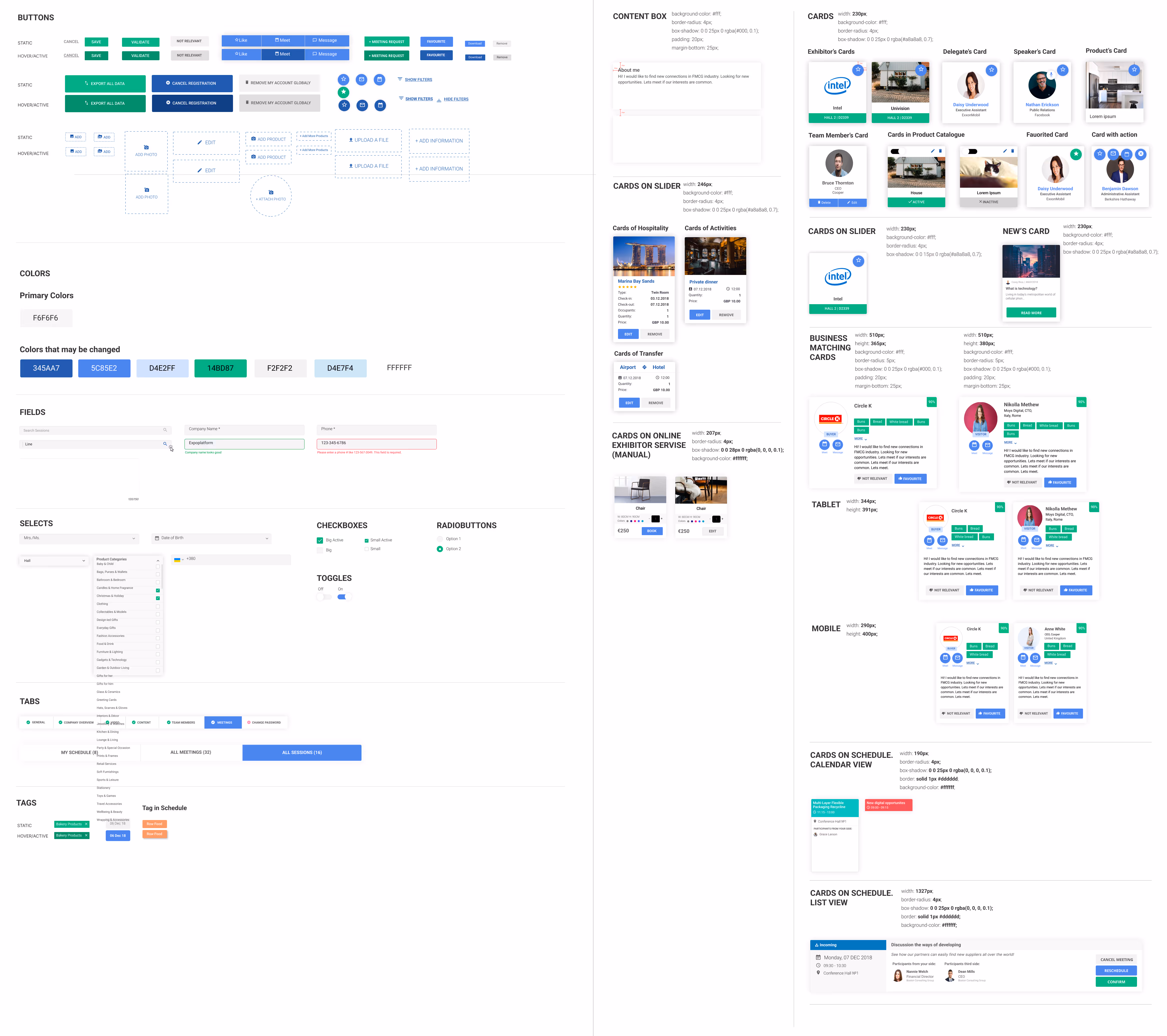
To streamline design consistency and improve developer handoff, I created a comprehensive UI Kit for ExpoPlatform. It included reusable components, typography, color styles, and spacing guidelines, ensuring a scalable and cohesive design across the platform. This system helped speed up development and maintain a unified user experience.

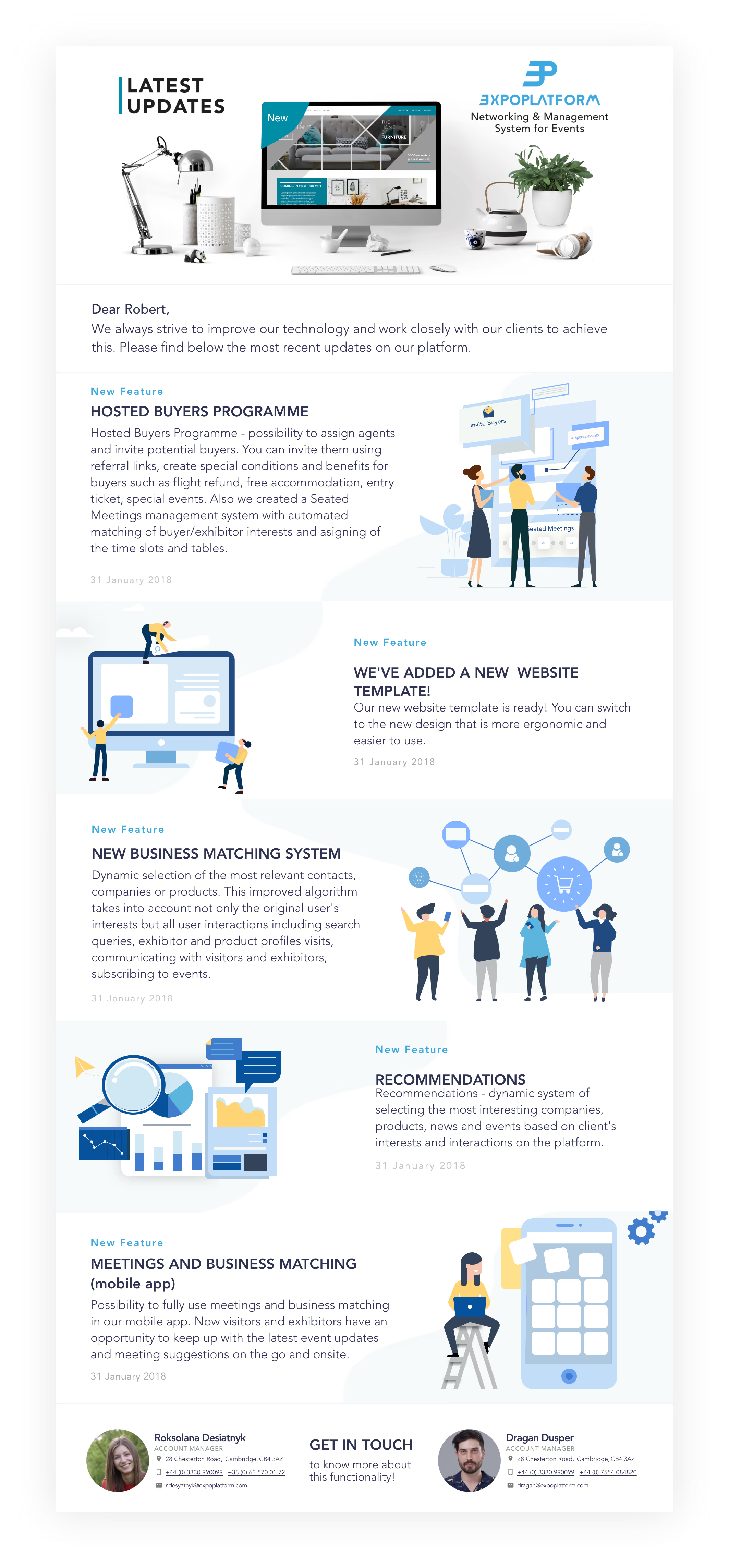
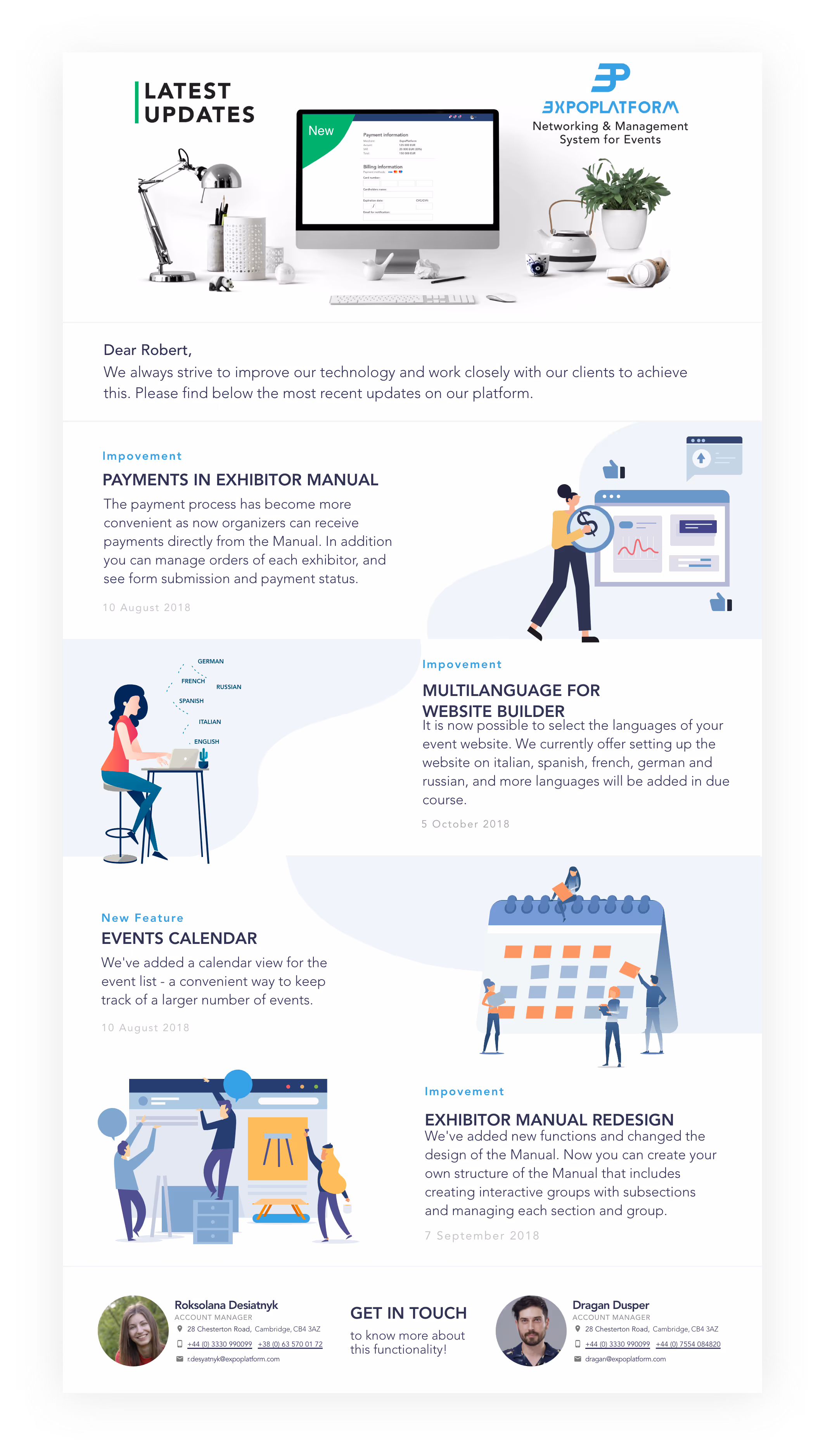
At ExpoPlatform, I designed engaging and user-friendly emails showcasing the company's features.
I designed graphic elements for marketing materials and email campaigns to visually highlight the company's features.
My work at ExpoPlatform involved creating marketing materials, email campaigns, and UI designs to improve user engagement across web and mobile.
By structuring content effectively, I helped users discover and interact with new features more easily.
I designed custom icons and banners to make ExpoPlatform’s emails more engaging and visually appealing.
I developed illustrations and graphic elements that highlighted key features, making complex information easier to understand.
